Best Cannabis Branding: How Marijuana Companies Can Captivate Consumers
The best cannabis branding is what separates products that catch a shopper’s eye from those that fade into the shelf.
In a crowded cannabis market, branding does more than meet compliance requirements; it creates recognition, communicates value, and builds emotional connection. For cannabis brands, a clear and consistent identity helps consumers understand who you are, what you offer, and why they should choose you again.
This article breaks down what effective branding looks like in practice, with clear guidance on creating a brand that feels recognizable, credible, and consistent across touchpoints.
Understand Your Audience
The strongest cannabis brands begin with a clear understanding of the people they serve. To create a cannabis brand strategy, you need insight into who your customers are, what they care about, and how they make buying decisions. Consumer research removes guesswork and helps your brand communicate with purpose.
Start by developing detailed consumer personas based on real data. These personas should reflect demographics, lifestyle habits, personal values, and purchasing behavior. Use research to answer key questions such as:
- What drives their cannabis choices: wellness, relaxation, recreation, or social influence?
- Which visual styles, brand tones, and in-store or digital experiences resonate with them?
- How do they perceive existing cannabis brands, and where do they see gaps or sameness?
When branding is shaped by real consumer insight, it connects on an emotional level instead of relying only on visual appeal. That connection builds recognition, trust, and long-term loyalty.
Define Your Brand Mission and Personality
Consumers respond to cannabis brands that have a clear mission and a distinct personality.
Your brand mission explains why your company exists beyond selling products. It should reflect the values you stand for and the impact you want to have on your audience. Strong missions help customers understand what matters to your brand, whether that’s promoting wellness, supporting sustainable practices, or building community trust. For example:
- Wellness-focused: “We empower mindful self-care with natural cannabis products designed to support balanced living.”
- Luxury experience: “We deliver premium cannabis moments with refined quality and thoughtful design.”
- Sustainability and ethics: “We grow and source cannabis with environmental care and community respect at every step.”
Your brand personality influences how people feel about your business. This personality should guide your tone, imagery, and customer interactions. Are you:
- Playful and energetic? Casual language and bright visuals can make your brand feel approachable.
- Calm and wellness-oriented? Soft tones and clear educational messaging emphasize care and health.
- Authoritative and informative? A precise, factual voice builds credibility, especially for medical or high-quality products.
Consistency matters. Every touchpoint (from packaging to social posts to customer service) should reflect your mission and personality so consumers instantly recognize your brand. Over time, this coherence builds trust and makes your products memorable in a crowded market.

Develop a Unique Value Proposition (UVP) for Customers
A unique value proposition (UVP) tells consumers why your brand is worth their attention. In competitive markets, the best cannabis branding makes that difference obvious within seconds. Your UVP should explain what you do better or differently, and why that difference matters to the customer.
Your UVP may focus on one primary strength or a clear combination of benefits, such as:
- Product quality or innovation: precise formulations, consistent effects, or standout genetics.
- Organic or sustainable sourcing: clean inputs, responsible cultivation, and transparent practices.
- Lifestyle alignment: support for wellness routines, creative expression, or community connection.
Once defined, your UVP must show up everywhere. Packaging should signal it visually. Website copy should state it clearly. Social content should reinforce it through tone, imagery, and messaging. When consumers encounter your brand, they should quickly understand what you stand for and why it fits their needs.
A strong UVP reduces confusion, strengthens recall, and helps customers choose your brand with confidence.
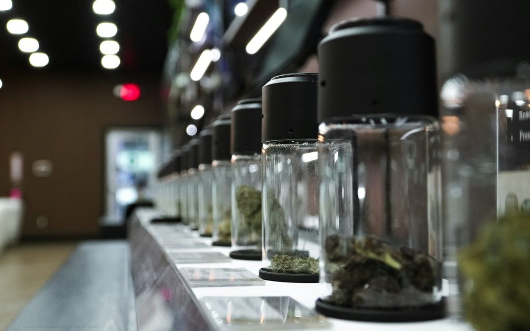
Design a Cohesive Visual Identity
Visual identity shapes how consumers recognize and remember your brand. In many cases, it’s the first signal that tells someone whether your product feels relevant to them. The best branding uses visual design to communicate quality, purpose, and personality at a glance.
Key elements of a cohesive visual identity include:
- Logo and typography – Clean, legible, and consistent with your brand personality. Type choices should support readability while reinforcing whether your brand feels modern, calming, bold, or refined.
- Color palette – Colors influence perception and emotion. Earth tones often signal wellness and sustainability, while high-contrast or muted palettes can suggest luxury or creativity.
- Imagery and design style – Photography, illustration, and icon systems should reflect your consumer’s lifestyle and values, whether that’s wellness routines, social settings, or creative spaces.
Be intentional with cannabis-specific visuals. Overused elements like leaf icons or green-heavy palettes can make brands blend together unless they clearly support your positioning. A distinctive and consistent visual system helps consumers recognize your products quickly and associate them with a specific experience or feeling.
Craft a Consumer-Focused Brand Voice
How your brand communicates shapes how consumers relate to it. Cannabis branding best practices require you to speak clearly, consistently, and with purpose. Your brand voice should reflect your personality while addressing what consumers care about most and how your products fit into their lives.
A strong brand voice does three things well:
- Uses storytelling to build connection – Simple, real-world stories help consumers see themselves using your products, whether that’s winding down after work or supporting a daily wellness routine.
- Emphasizes benefits over features – Instead of listing product specs, explain how the product helps the consumer feel, function, or experience something better.
- Stays consistent across channels – Packaging, social media, email, and website copy should all sound like they come from the same brand, not separate teams.
Consistency builds familiarity. Familiarity builds trust. When consumers recognize your voice and understand what you stand for, they are more likely to remember your brand and return to it.

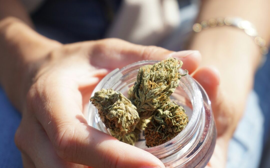
Leverage Packaging as a Branding Tool
Packaging is one of the most influential touchpoints in the cannabis buying journey. For many shoppers, it’s the first physical interaction they have with your brand. The best cannabis branding treats packaging as both a compliance requirement and a communication tool that signals quality, trust, and value.
Effective cannabis packaging balances clarity, design, and material choice. Best practices include:
- Clear labeling with product details – Consumers should quickly understand potency, format, intended use, and expected effects without confusion.
- Eye-catching design aligned with brand identity – Packaging should stand out on crowded shelves while staying consistent with your visual system and brand personality.
- Sustainable or premium materials – Recyclable, reusable, or high-quality finishes can increase perceived value and align with wellness or eco-conscious positioning.
When packaging communicates clearly and looks intentional, it reduces hesitation at the point of sale. A thoughtful unboxing experience reinforces brand recall and increases the likelihood that a first-time buyer becomes a repeat customer.
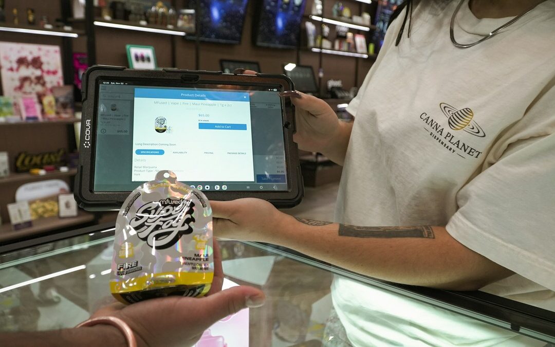
Build a Consumer-Centric Digital Strategy
A strong digital presence supports discovery, education, and repeat engagement. Premium cannabis brand positioning extends beyond packaging and retail into digital spaces where consumers research products, learn routines, and form brand preferences.
Website and SEO
Your website should clearly explain who you are, what you offer, and how your products fit into a consumer’s life. Strong SEO helps connect your brand with people actively searching for cannabis products, effects, and use cases. Focus on product-specific keywords, lifestyle-related searches, and a clear site structure so visitors can find answers quickly and move confidently toward purchase.
Content Marketing
Educational content builds trust before a consumer ever reaches a dispensary. Blogs, guides, and FAQs help people understand product formats, effects, and usage while positioning your brand as a reliable source of information. Clear, accurate content also supports SEO and keeps your site relevant over time.
Social Media
Social platforms help humanize your brand and reinforce lifestyle alignment. Instagram and TikTok work well for visual storytelling, routines, and short-form education, while email newsletters and loyalty programs support ongoing relationships. Consistent posting and a recognizable voice keep your brand familiar between purchases.
Engage Consumers Beyond Products
Strong brands build relationships that extend past the purchase. The best cannabis branding creates opportunities for consumers to connect with your brand in meaningful, real-world ways that reinforce trust and loyalty.
- Events and experiences – Sponsorships, pop-ups, and branded activations allow consumers to interact with your brand outside the dispensary. These moments make your brand feel tangible and human, not just transactional.
- Community and loyalty programs – Reward programs, educational workshops, and exclusive access encourage repeat engagement while making customers feel valued. Community-driven efforts also support word-of-mouth growth.
- Customer feedback loops – Reviews, surveys, and direct feedback help you understand what’s working and where expectations aren’t being met. Listening closely allows you to refine both branding and product offerings over time.
When consumers feel involved rather than marketed to, they’re more likely to stay loyal and advocate for your brand. Engagement builds familiarity, and familiarity builds long-term brand strength.

Measure and Optimize Branding Impact
Branding works best when it’s measured and refined over time. It should rely on data to understand how consumers perceive your brand and how that perception influences behavior. Tracking the right metrics helps you identify what resonates and where adjustments are needed.
Focus on performance indicators that reflect both awareness and engagement, including:
- Brand recall and recognition – Measure how easily consumers remember and identify your brand across channels and retail environments.
- Website traffic and conversions – Track visits, time on site, and actions taken to understand how effectively your digital presence supports decision-making.
- Social engagement and sentiment – Likes, comments, shares, and sentiment analysis reveal how audiences respond to your messaging and tone.
- Repeat purchase rates – Returning customers signal trust, satisfaction, and long-term brand value.
Use these insights to refine your messaging, adjust visuals, and improve consumer experiences. Small, informed changes help keep your brand relevant and aligned with consumer expectations.
Final Word
The best cannabis branding stays focused on the consumer while remaining compliant and consistent across every touchpoint. Brands that understand their audience, define a clear mission, build a recognizable identity, and engage people beyond the product earn attention and trust in crowded retail environments.
If you’re looking to bring these ideas to life, Custom 420 Supply helps cannabis brands build and execute branding through custom cannabis packaging and label design. From early brand development to packaging that stands out on the shelf, our team supports consumer-focused branding that aligns with your goals and your market.
Want to learn more? We invite you to reach out through our contact page today.
Frequently Asked Questions
What qualities define the most successful cannabis brands?
The most successful cannabis brands focus on clarity, consistency, and consumer trust. They understand their audience, communicate a clear purpose, and deliver a recognizable experience across packaging, messaging, and digital channels. These brands also prioritize transparency, compliant labeling, and reliable product quality, which helps build confidence and encourages repeat purchases over time.
How can cannabis companies create a memorable and consistent brand identity?
Cannabis companies build a memorable brand identity by aligning their mission, visuals, and voice across every consumer touchpoint. This includes a cohesive visual system, a defined brand voice, and packaging that reflects the same values as the website and social media. Consistency is key: when consumers see the same tone, design cues, and messaging repeatedly, the brand becomes easier to recognize and remember.
What strategies do top cannabis brands use to differentiate themselves in the market?
Top cannabis brands differentiate by clearly communicating what makes them distinct. This may include product quality, sustainable sourcing, wellness positioning, or lifestyle alignment. They also use thoughtful packaging design, educational content, and community engagement to reinforce their message. By focusing on consumer needs and delivering a clear value proposition, these brands avoid blending into a crowded market and stand out at the point of sale.